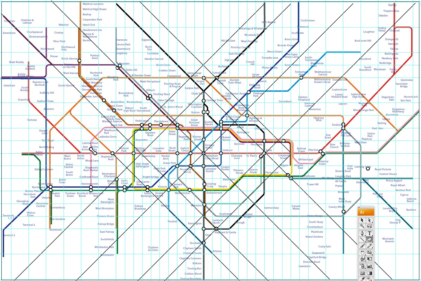
The London Underground Diagram, or Tube map, as it’s popularly known, is one of the great icons of British design. A radical solution at the time of its drafting by Harry Beck in 1931 and subsequent publishing in 1933, it’s been the modern blueprint for transport network diagrams the world over.
With the coming introduction in 2010 of swipeable Oyster cards for seamless travel across Greater London by train, bus, tram and boat, there was concern that the Tube map’s iconic simplicity, already with cluttered with periodic additions, would be all but buried under all the new information it had to accommodate.
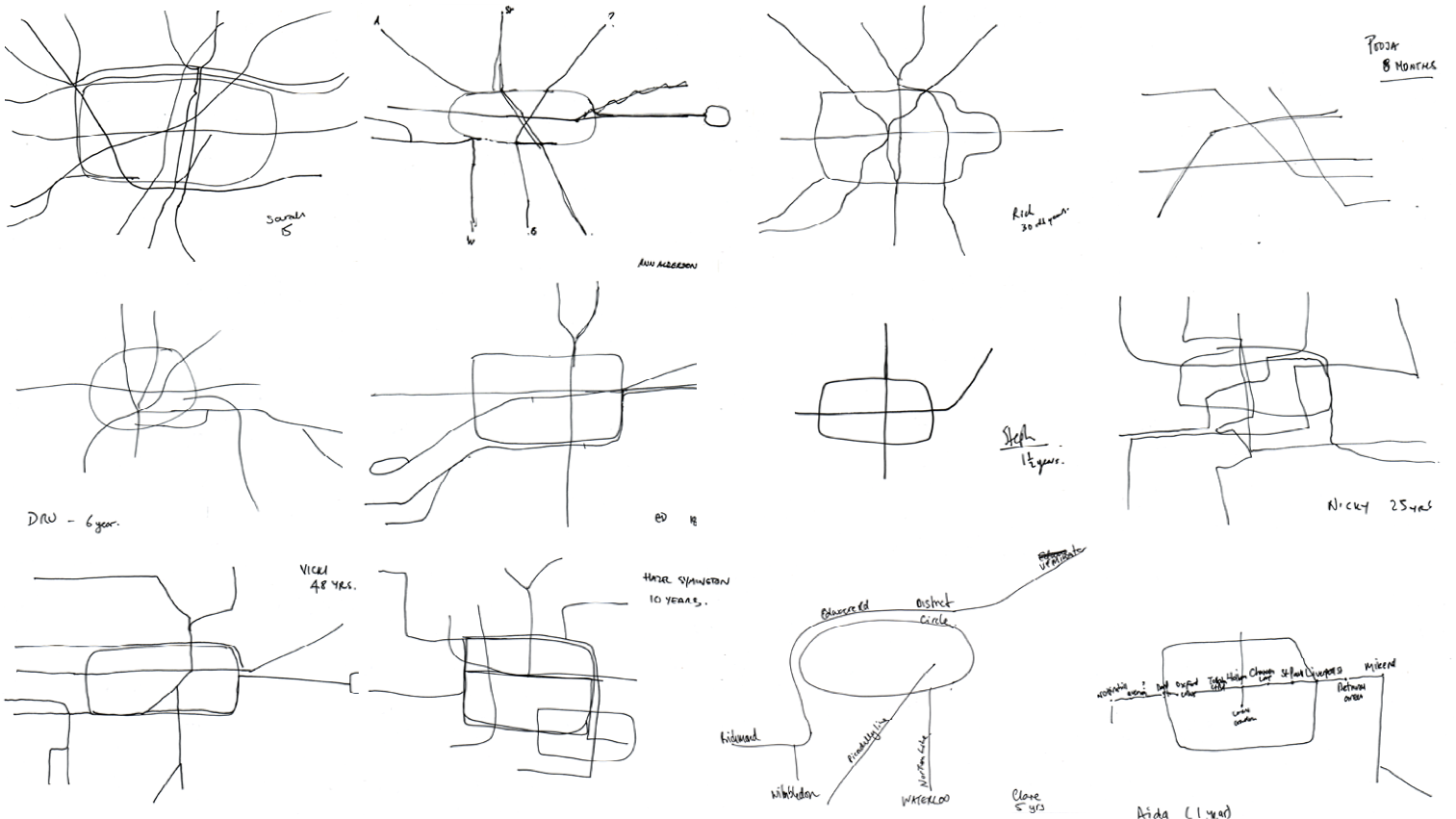
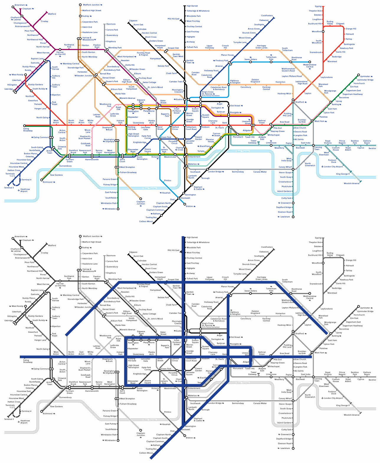
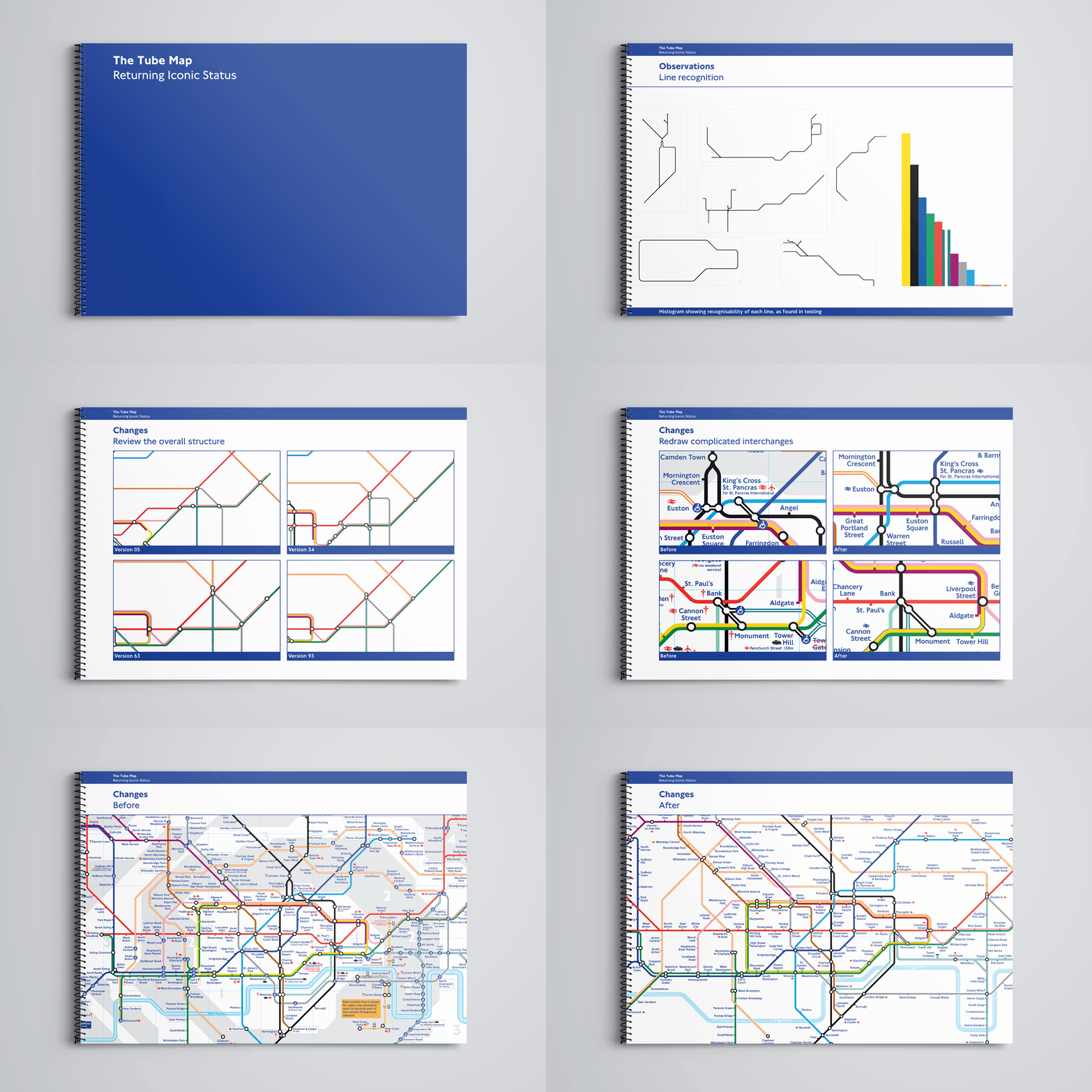
We were set the challenge of restoring the map’s iconic status. I devised an approach that drew from cognitive psychology and user-centered design, as I encouraged the team to discover, rather than assume, what made the map justifiably iconic—and crucially, how we could safeguard and strengthen these properties while preparing the map for the incoming wave of new information. Properties, as we discovered, such as the combination of language (Circle Line, Central Line, Northern Line) and respective skeletal shapes in the network that could help people who rode on the Tube to quickly comprehend its structure and easily store a ‘mental map’ in memory.
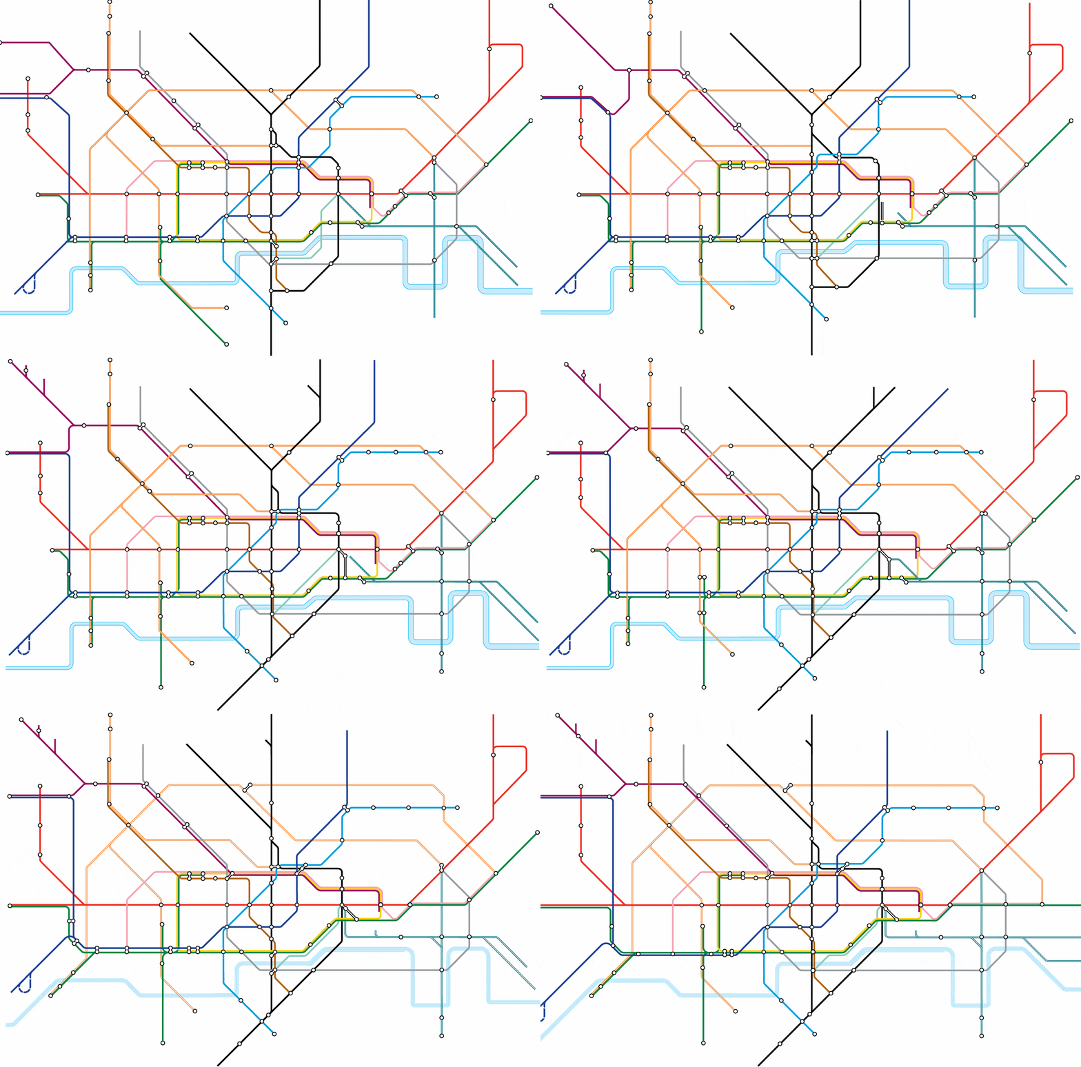
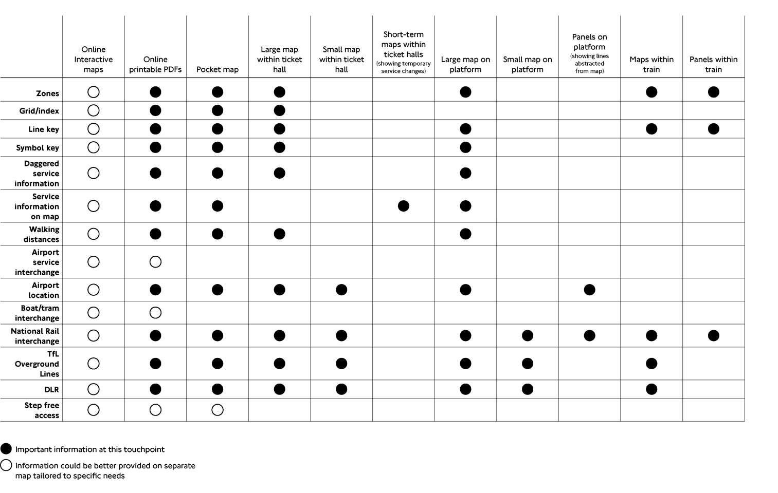
Also central to the approach was to argue for a family of diagrams; different versions of the Tube Map for different stages of the journey, from station ticket hall to platform to onboard the train, or for online journey planning. For each version, certain information ‘layers’ could be ‘switched’ on and off according to relevance, thereby preserving a higher degree of overall simplicity.
Much of our proposed update was put into effect, along with some of TfL’s own measures. (We’ll pretend they never published a version that left off the River Thames.)


